Your imagination is the limit

In the competitive market we live in today, every business should be looking for new ways to maintain and grow their business. It helps if new projects are aligned with your core business and, even better, if they can be targeted at an existing customer base. Retaining or growing business with an existing customer is always much easier and more successful than entering completely new markets.

The ChromaLuxe and Unisub range of products provide one great way of doing this; and one with nice margins and ease of use.

Universal Woods produce ChromaLuxe which is a range of dye sublimation coated panels. They are available on aluminium sheets, MDF panels and hardboard. Images, photos and graphics can be easily transferred to the panels. The result is super high quality images on a very durable tough surface which is scratch, fire and moisture resistant.

Unisub is essentially a very similar product, also from Universal Woods, but aimed firmly at the gift market with items such as clocks, trays, plaques, coasters and table mats, key rings and luggage tags. Basically smaller sizes that only need an A4 or A3 printer and similar sized heat press.

Featured image

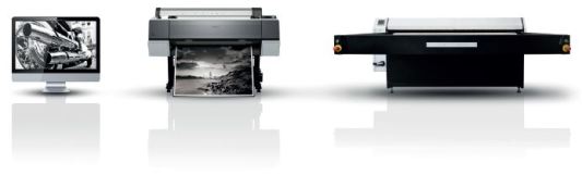
Production of both ChromaLuxe and Unisub products requires a dye sublimation printer (with inks and paper, of course) and a flat bed heat press. A basic system capable of printing up to A3 will leave change from €2,000. A full size system capable of printing up to 1.2m x 2.4m can cost over €50,000. But a Midi sized system capable of printing up to 75x110cm will cost a more modest €15,000. Such a system is great for printing large panels but can also produce tiny items like dog tags! Remember that because it is a dye sublimation process, the printer and press can also be used for printing on textiles. With typical sales pricing the Return on Investment can often be only a few months with a very modest print production of 3 or 4 prints per week.

But what is the market for these products? Well, we always say that “your imagination is the limit”. Photo prints is the obvious and main use, but we now see more and more creative adaptations. One of our largest clients is making only table tops, predominantly for the café and bar market – it’s a great promotional tool. Another huge client specializes in whiteboard for hospitals, schools and corporate use. Whiteboard pens can be used on ALL our products without creating any damage. Should someone accidentally use a permanent marker (we’ve all seen it happen!) it can be quickly cleaFeatured imagened off with some acetone or similar cleaning product. Even better, it does not leave any shadow mark.

Other potential uses are Indoor signage – you could use our clear aluminium as an alternative to anodized plates. Other uses are for Serial number plates for equipment, machinery plates, Advertising A-boards etc.

So now look at your customer base and think about what could be done. Some great examples – Spas, hotels, golf clubs (tee off boards, membership bag tags), sports clubs, football clubs (famous clubs could have a range of gift items), corporate wall décor and signage, manufacturing (safety panels). Museums love the product as it can be touched by kids and cleaned easily.

The list is endless.

Let’s have a quick look at the photo market. For many years all our photos were taken on film and then produced as prints using a chemical process. As we know digital photography has now replaced film almost totally. But photo prints from our digital images made with photo chemicals are still very popular and provide a very high quality result. Photo labs offering online prints at 10×15 cm and 13×18 cm sizes still do huge business. At the high end, large format prints are often made with the chemical process and then mounted on Dibond or behind acrylic.

However, at the same time over the last 15 years, we see a lot of inkjet printing onto art papers, canvas, banners etc. The quality has improved dramatically over the years, but in terms of quality photo chemical based papers are still the benchmark.

Where does dye-sublimation fit into this? First of all do not get confused with those little dye-sub printers used in many photo kiosks that produce 10×15 cm prints using RGB/CMY coloured films. Real Dye-sublimation is the process where prints are made onto a paper using special sublimation inks. The ink is then transferred to a coated material in aFeatured image heat press using high pressure and high heat. The substrate can be a textile or a hard substrate like ChromaLuxe and Unisub. Hard substrates include aluminium, MDF, hardboard and FRP.

So how does a ChromaLuxe print compare with our benchmark of silver based photo paper going through a chemical process. In terms of colour gamut (the range of colours that can be printed), a ChromaLuxe print very closely matches the photo paper and is much better than prints from an inkjet flatbed printer. As the inks are infused into a multi-layer coating on the ChromaLuxe, there is an impression of 3 dimensions and the colours truly ‘pop’. But a very big advantage is that the surface is incredibly durable – tough and long lasting. Firstly, with a surface rather like glass, it is extremely scratch resistant unlike papers and it can even be cleaned with powerful industrial cleaners. Secondly, testing by the Rochester Institute of Technology has shown that it has over twice the print life of the very best photo paper when exposed to Xenon Arc light fade tests.

So as I said earlier, your imagination is the limit! With sublimation you can open up new profitable markets which can help you compete and grow a profitable business in these difficult times.


Featured imageCharles Henniker-Heaton has over 30 years experience in the imaging industry, first at Durst and then at Fujifilm as a senior manager involved in retail photo, chemicals and since 2006 as European Marketing Manager for large format printing. He joined ChromaLuxe EMEA in 2014 in charge of European Business Development for large format.

Art Prints and Limited Editions

Back in April I wrote about “Photography or Art” where I explored when photography became art. I find myself now looking at upcoming fairs like The Accessible Art Fair in Brussels and The Affordable Art Fair which now operates in 11 countries. Due to the high quality ChromaLuxe output of our local Brussels lab, Labo JJ Micheli, we have seen increasing use of ChromaLuxe at the Brussels exhibitions in preference to Diasec prints.

These two fairs do exactly what they say and concentrate on art that is affordable and accessible, typically with maximum prices limited to approx. €5000 – €6000 but with many works at very ‘democratic’ prices of under €100. Artists and photographers are encouraged and invited to exhibit and sell direct to the market.

Featured image

Photographs and Photo-Art are often exhibited as prints on fine art paper or using high-end acrylic Diasec prints. ChromaLuxe offers a very valid alternative with its punchy colours and almost 3 dimensional look. Even with the gloss version, images reflect better than under acrylic or behind glass.

A lot of the artworks presented are offered as limited edition prints as these fit well in the price range. But what is a limited edition? There has been a lot of discussion around this and there is no legal definition – it is basically left to the ethics and responsibility of the individual artist. In the days when prints were often made by screen printing or from woodcuts, lithographic stones etc, the edition would be limited by the process being used (which would often wear out) and by destruction of the original plates/medium. With digital images, the rules have changed as there is generally no limit to the print quantity or the size.

Featured image

A limited edition should come from an original artist’s work and not from a reproduction of let’s say a famous Master’s work – for example Manet’s paintings reproduced as posters. An edition should normally be between 10 and 150 images plus perhaps a couple of AP (Artist Proofs) which are made to control the consistency and quality of the other prints. Prints should be signed and numbered showing the print number and the total quantity of the edition – 45/120 for example. Each print should also have a unique Certificate of Authenticity explaining the medium, the number of prints in the edition, link to the specific print and artist’s signature. With ChromaLuxe prints, artist’s signatures and print numbers can be added digitally on the face of the image, printed on the rear or engraved – the important part is to link the print to the CoA.

What about a second limited edition of the same image but at a different size and on a different media – perhaps paper prints of 40x50cm and canvas prints of 1mx1m? This is a difficult one and practised by many artists/photographers. It becomes a question of their integrity and position in the market and their honesty with the clients as it does have an effect on the value of their work. What I did see recently which is extremely dubious was a second edition of the same image on the same material at the same size – the only difference was the addition of one person into the image!

Finally – hand embellishment. This is something I personally like. A good example would be a limited edition of 10 prints where the artist has added something to each image by hand. This might, for example, be the addition of some gold or pearlescent paint in part of the image that cannot be reproduced digitally. The edition is limited but each image is also unique. Nice idea.


Featured imageCharles Henniker-Heaton has over 30 years experience in the imaging industry, first at Durst and then at Fujifilm as a senior manager involved in retail photo, chemicals and since 2006 as European Marketing Manager for large format printing. He joined ChromaLuxe EMEA in 2014 in charge of European Business Development for large format.

Photographer Fred Eral is bringing ChromaLuxe to the ‘Rencontres Internationales de la Photographie’ in Arles

Firstly, I would like to introduce myself, I’m Fred Eral, a photographer who lives and works in the South of France, in Arles, in the heart of the Camargue.

To give you an idea, Arles is the city that organises the Rencontres Internationales de la Photographie. During the first week of the festival, there were 13,500 visitors and every year I exhibit my work in the Festival Off.

For over 10 years I have worked as a photographer, exhibiting in France and abroad; I have had many publications in various magazines, in the press, and have been exhibited in the Galerie d’Art in Belgium.

Most of my work as a photographer revolves around the Nature and by ‘posing’ Man; specifically, the Artistic Nude Male in a natural environment whereby Nature figures prominently with the Human. For the last three years my Male Nude works took a different direction by posing my male models under water in the Mediterranean, or on the Blue Coast as we call it. The Model and I were free diving without snorkels to respect nature and to be closer to it without artifice and to be as natural as possible.

Featured image

When I last came to Belgium, visiting some friends, I discovered ChromaLuxe. My friends, who are also photographers, thought of me and my next exhibition, saying “that’s great and your underwater pictures would harmonize perfectly with ChromaLuxe prints”. So they showed me that they had produced various jobs on ChromaLuxe and from that moment I was hooked. I could see my pictures of underwater nudes on this media and how they would benefit.

Luckily I was able to make some ChromaLuxe photo prints and I was absolutely not disappointed with the result. I discovered a depth, a strength, bursting colors, an impression of being in the water with the model.Featured image

In fact, during my exhibition INDOMITUS, which took place in one of the most prestigious locations in the city of Arles, the Espace Van Gogh, and where I was able to exhibit for ten days in June 2015; there was an echo, a feeling and the response of several people: “Your exhibition soothes us. I love the power of the color. The prints are beautiful, full of strength, and make us believe that we are underwater with the model etc … “. The praise for the work that was produced on ChromaLuxe was unanimous and positive.Featured image

“Your exhibition soothes us. I love the power of the color. The prints are beautiful, full of strength, and make us believe that we are underwater with the model etc … “

Finally, I would say that my collaboration with ChromaLuxe has been a positive experience with people whose work and qualities are very professional. I recommend them to photographers or anyone who values their work.

If you want to get an idea of ​​my work, the INDOMITUS exhibition is still on show in Arles, at the Hotel Le Belvedere Arles, until August 30, 2015.

Featured image

It all starts with a sharp image …

If you ever produced a ChromaLuxe panel, than you know that it will show every detail and color of your beautiful image … also when your image is not 100% sharp. It all starts with a sharp image, and sometimes that’s not the case (because you didn’t shoot the image yourself for example). That’s one of the reasons why they did invent the application Photoshop back in 1988. In the latest versions of Photoshop, you have the filer called “Unsharp Mask”. The Unsharp Mask filter in Photoshop works by increasing the contrast of your image and I will explain below how to use it in a proper way:


How to sharpen photos with the Unsharp Mask filter

STEP 1 : Crop and resize
Open your image in Photoshop. Use the Crop tool to crop the image as desired. Choose Image > Image Size, enable the Constrain Proportions and Resample Image check boxes and set your desired resolution and size. We set Resolution to 300 Pixels/Inch and Width to 16 Centimeters. Click OK.

 1

STEP 2 : Launch the filter
To sharpen the image, choose Filter >
Sharpen > Unsharp Mask. Click a portion of the image that contains detail such as the centre of the flower. This then appears in the filter dialog box sized at 100%.

2

STEP 3 : Set the Amount
Set the Amount to 150%. The Amount controls how much sharpening is applied to the image. You can readjust this later, but for now, you want to see the results of adjusting the other sliders clearly.

3

STEP 4 : Radius tweaks
The Radius sets the width of the haloes around the image edges. The larger the Radius, the wider the haloes are. For a sharp image, set the Radius to something between 0.5-1.5. We used a setting of 1.0 here.

4

STEP 5 : Adjust the threshold
The Threshold setting controls how much difference in brightness there must be between adjacent pixels for them to be considered an edge. A small Threshold value sharpens everything and a large one sharpens nothing. We set the Threshold to 10.

5

STEP 6 : Fine-tune the result
Readjust the Amount to fine-tune the result. When sharpening for your output on a ChromaLuxe panel, adjust the Amount based on what you see on your (calibrated) screen. Do not over-sharpen, because on the ChromaLuxe panel, you will see the over-sharpen effect very easily. Click OK to apply and save your sharpen image.

6

Now your image is ready to print on the ChromaLuxe panel. Add your image in the RIP software to print it on a professional large format sublimation printer and enjoy the sharpness and details, after pressing it on a heat press, on the size you want.

END


stevieSteven Roesbeke has a huge experience in the graphical industry with a lot of expertise in color management and output solutions. Since 2013 he is the Technical Support Field Engineer at Universal Woods EMEA. Read his technical blog posts to discover helpful tips & tricks and learn more about the do’s and dont’s of (large format) sublimation. You can always contact him at stevenr@chromaluxe.com

In the press! Be short, but original!

There’s nothing more exciting than seeing your name or your products in a magazine. The rapidly flipping through the pages of the edition that has just arrived, the nervously scanning for mistakes (in the e-mail address, phone number you provided…), the sigh of relief when you discover none, the knowledge that many people will read about you. It could be an addiction.

Bringing out your product or brand is important. As a (small) company you could spend fortunes being in all different magazines. The problem is: even if you are willing to spend it on advertising, how many people will you reach? No promises can be made. The sales person who sells you the ad will shout that his magazine is sold to 15000 people and will be read, held, fluttered and fumbled by up to 40000, can’t really promise you that all those who touch the magazine will also see your ad and read it. A ‘percentage’ will.

Advertising of course isn’t all about immediate sales: you can’t expect of everyone who sees your ad to act upon it. There are however some things to think about when you’re considering to advertise.

Featured image

ChromaLuxe is a brand and a product with many different opportunities when it comes to external communication. We want to talk to the end user about the panels, so that they will know of the product and decide they want it in their living room. We also talk to professionals to convince to offer our products to those end users. Different target audiences, different media.

Let’s concentrate on talking to the general public, the end user. Let’s say you’re selling ChromaLuxe panels: Try for looking at other opportunities than the regu!ar full-page ad. Look in the magazine for the short news facts: the pages with the small news items are the pages that are read most in a magazine. It’s short, it’s fast and it’s refreshing and quite often the possibility to announce a discount or give away 10 free panels.

Both options are interesting:

  • If you give a discount, people either order a panel from your website or call you with a specific code. This tells you know how many people decided to make use of the offer and where they saw you. A discount needs to be interesting though: for 5% no one will start up their computer. Also always mention net prices instead of percentages. This will appeal more to your audience.
  • When you give away free panels, you can limit the offer to 5 or 10 panels, only keep in mind that your readership must at least think they can win. I don’t know if many people will start up their computers for 1 or 2 panels, so make the offer enticing. You’ll also need to pay for sending the panels to the winner, so take that in to account. Another pro: If you have the contestants send an e-mail, you build up a nice database at the same time.

Featured image

If you want to try one of these options, you’ll need to talk to the editorial staff of the magazine. Sending them a panel with one of their pictures will show them the product and quality in advance and you might even get more out of it than a small article. For the magazine this is interesting as well: they have something to offer to their customers and have something to fill the gaps. Everyone wins!

One more tip! When you want to go for traditional advertising, always ask for the possibility to get an editorial. That doesn’t necessarily needs to be a complete article on your company, but it can be a mention in an article about design or new trends or a short article on a page – right – as mentioned above. It’s all about getting noticed!


Featured imageCarolyn Krekels is jr Marketing Manager at Universal Woods EMEA, in Schelle, Belgium. She has been taking care of the EMEA marketing for the Universal Woods products for 9 years so far, first working for the EMEA distribution partner of Universal Woods. In 2012 she joined the Universal Woods EMEA team. In Carolyn’s posts, she will give you insight in the marketing actions organised by Universal Woods EMEA and can give you useful hands-on tips on how to bring your product to the market. Contact her via carolynk@chromaluxe.com

Different countries? Different cultures!

Can you imagine that you come in a country for the first time without decently informing you on beforehand about the habits of that country?
Well, I had that experience with a colleague with whom I visited Japan.
When visiting a company in Japan it is very common that you have to take off your shoes at the entrance and change them for slippers that are mostly open at the front.
If this habit would have been known I am sure that you never visit a company in Japan without first checking the status of your socks.

Wikipedia is a very good source to learn about specifics of a country, this is what we call culture. It also gives you good information about demographics, food and e.g. the tip system.

In Japan for instance they are not used receiving tips, you just pay what is on the bill. You can imagine how surprised the taxi driver was when he received a tip of 20% from my US colleague who assumed that the tip system was the same as in the US.

Two nice examples showing you how important is it to inform you as good as possible about the culture and habits of the country you are visiting.

Our company is in the fortunate position that our products are popular all over the world. The pleasant consequence of this is that it’s necessary to travel to many countries and continents to support existing customers and to appoint new customers in countries where our products are not yet available.

Featured image

Eating with chopsticks in Japan.

From our EMEA entity, located in Belgium, we are looking after Europe, Middle-East, Africa and a part of Asia. This geographically area is very extensive and the culture not just varies from continent to continent but also from country to country and sometimes we even have to deal with different cultures in the same country. No need to say that this makes it all very challenging and requires a very careful preparation before starting the travel to another place.

What exactly is culture?

Let me first say that I want to share some experiences about national cultures and not about corporate cultures although that also can make your professional life interesting.
All of you who work in a company will have to deal with a company culture.

Featured image

Training in South-Korea.

There are many definitions of culture. I feel that the below descriptions explain best what I want to share with you in this blog.

“Culture is the learned and shared behavior of a community of interacting human beings”

“Culture is the collective programming of the mind which distinguishes the members of one category of people from another.”

Charracteristics of culture:

  1. culture is learned (behavior, language)
  2. culture is shared by a group of people
  3. culture is cumulative
  4. cultures change
  5. culture is dynamic
  6. culture is ideational
  7. culture is diverse
  8. culture gives us a range of permissible behavior patterns

The above will give you some idea what culture is and why it is “especially” in business so important to take this into account when visiting countries and people.

Featured image

Meeting in Nairobi, enjoying a local beer.

When you are in sales and have to sell your products in other geographical areas to people who don’t share your standards, values and culture, it is an absolute must that you inform yourself before you go there. There are many sources where you can find information how to approach people and how to behave in a culture that is different from yours.

Some derivatives of culture are the way you present yourself, how you dress, how you hand over your business card, what are the eating habits, do you need to bring presents or do you have to avoid this, who serves the drinks and to whom first and many other seemingly unimportant things but all of these can make the difference between succeeding or not succeeding!

Just keep in mind that also you want to be treated in the way you are used to and feel most comfortable with. This is the same for those who you visit.

I have the privilege to regularly travel to other parts of the world and always prepare myself seriously and in a way that reduces the chance coming in unforeseen situations. This is very much appreciated by your interlocutor(s) and shows them that they are taken serious.

Featured image

Many of you spend their holidays abroad. Although apparently less important than going on a business trip, I recommend that you also deepen yourself in the habits and culture of the country you are visiting.
By spending some time in doing this you will have fun whilst preparing your travel, you will feel much more comfortable and will face less unexpected surprises.

I wish you all a great, relaxing and sunny summer period, wherever you may go!


Erik WiegmFeatured imagean’s career in the Sign and Engraving industry started over 30 years ago. With experience in signage and personalization for many years, in 2005 Erik got involved in sublimation. In 2011 Universal Woods established its own affiliate in Belgium of which Erik became Managing Director. Together with a dedicated team he successfully worked on further expanding the Unisub brand in the EMEA region and bringing ChromaLuxe to the market.
You can contact Erik at erikw@chromaluxe.com.

Is your heat press up to it? Two easy tests!

If you want to start with large format sublimation, you need to have a professional heat press. You can find a lot of different brands on the market, so this means that it is very difficult to know which ones are the good ones.

You can only have optimum results if the pressure and temperature is equal all over the heat plates. Those 2 parameters are very important, because, when sublimating large format ChromaLuxe panels, you want the colour everywhere equal.

You can perform 2 easy to made test to know if you have a good heat press

TEST 1:

Print out 9 times a square panels (5x5cm) with 100% cyan colour. Put those 9 panels on your heat press (see image 1). Sublimate them together with the settings you would normally use.

Featured image

Let them cool down and lay them all next to eachother. Now check if they all have the same colour. Do check them in a room with good daylight colour and switch the 9 panels, so you are sure all 9 panels are equal in colour.

Image 2 = OK. Image 3 = Not OK.

Featured image

Featured image

TEST 2

Another test is to put 2 ChromaLuxe panels on your heat press, that are slightly bigger than your press, and press again one solid colour. Again, after sublimation and when the panel is cooled down, check both ends (upper and down), to verify if colors are equal.Featured imageAll steps in the sublimation procedure are important. When you’re not getting the results you had in mind, testing all different elements is key, so see which one influences your sublimation process. Start with these tests! They might give you some answers!


stevieSteven Roesbeke has a huge experience in the graphical industry with a lot of expertise in color management and output solutions. Since 2013 he is the Technical Support Field Engineer at Universal Woods EMEA. Read his technical blog posts to discover helpful tips & tricks and learn more about the do’s and dont’s of (large format) sublimation. You can always contact him at stevenr@chromaluxe.com

Innovation in Photography: the story told by guest blogger Jean Jacques Micheli

My first photographic experience was watching a black and white image appear in the developer bath in my father’s photo lab darkroom; I was about 6 years old. At this time, the professional photographer had to do everything himself from taking the original photograph, through to all the laboratory work. This was in the 1960’s and I took my early steps into the world of photographic printing.

Not long afterwards, a salesman came to show us a strange camera with bellows that, in one minute, could produce a black and white photo. The Polaroid became my second important discovery in the world of photography.

Of course, the evolution of cameras and the ever-advancing quality of new films have contributed to the overall improvement of the photographic image.

In the 1970’s when I was a student of photography a revolutionary colour process appeared on the scene – Cibachrome. This Swiss process was for me my third and most striking innovation allowing slides (diapositives) to be printed on a paper which had a metallic look and saturated high-contrast colours. Cibachrome became a huge success with photographic artists around the world, in part for its special image rendition but also for its long print life said to be between 50 and 100 years. Art works printed on Cibachrome still maintain very high values in the photographic art market.

Featured image
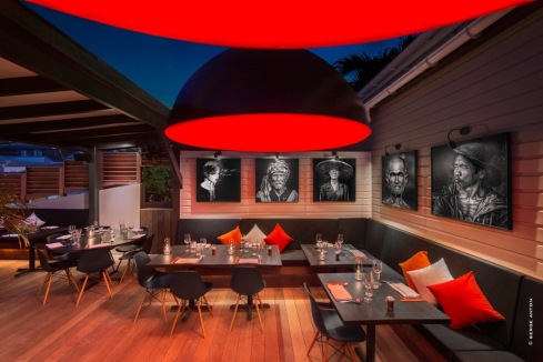
“Black Ginger” photos by Serge Anton

More recently, an article in an American photo magazine caught my attention. It spoke of “metal prints” with luminous colour and very precise details. After some research I discovered that it was an American photographic process which was virtually unknown in Europe, with the exception of the UK. With one of the principal activities of my lab being fine art printing for artists and art galleries, it was only natural that I would adopt this process. It is indeed very close to Cibachrome and many artists and photographers make the connection.

It is now 3 years since I started offering high-quality ChromaLuxe prints alongside silver and fine art prints; an ever-increasing number of artists have opted for this print media with its deep blacks (no other photographic process obtains this level of density) and its luminous colours. ChromaLuxe is also an excellent choice for outside displays because it is water and even graffiti resistant. It also has excellent scratch resistance during routine handling of images. We have, for example, some ChromaLuxe prints displayed on the island of Saint Bartholomew’s in the Caribbean in an open-air restaurant. Similarly, if you are able to pass by the new BO Bank in Brussels you will find a monumental 3D artwork, by the artist Yves Ullens, made entirely out of ChromaLuxe. It is not unusual for clients to send us mails enthusing about the quality of our work and the rendering of their images on ChromaLuxe.Featured image

ChromaLuxe is, without doubt, my fourth significant discovery in my already long photographic career.

Labo JJ Micheli was the first European lab to obtain the ChromaLuxe Quality Label certificate.


Featured image

Jean-Jacques Micheli has built his carreer around photography: from 1978 to 1982 as professional photographer and in 1982 he has created his photo lab in Bussels. He is specialised in Fine Art prints for artists, art galleries and societies. His lab is recognized for the excellent mastery of color and his team consists of image and finishing specialists. You can contact Jean-Jacques Micheli via +32 (0) 2 733 21 85 or jjm@labojjmicheli.be.

For more information : www.labojjmicheli.be

True Colours?

Working with photographers and printers I get involved in a lot of discussions about colour.

The first thing I will ask anyone is if they are working with a calibrated and profiled monitor. Many, even some professional photographers, are not. Do you work with raw files, I ask? ‘Oh yes!’ comes the reply. Well, if you work with raw files and do not have a calibrated and profiled screen, you are frankly wasting your time. Every correction you make is based on what you see on your screen. If the screen is wrong, the resulting file will have the wrong colours.

The best way of explaining this is to ask if they have visited a television showroom. If you have, you will know that every screen in the showroom will display different colours – see the photo. It’s Featured imagethe same with monitors – they are all different. Depending on the type of monitor, you will have different controls and settings, but once it is calibrated and profiled you will see a close rendering of the correct colours. If someone else also has a calibrated and profiled monitor they will see almost exactly the same colours. EIZO and NEC are probably the two most commonly used professional monitors. If you cannot afford a top end monitor like these, profiling will still bring you much much closer to the correct colours. Profiling is done to an international standard set by the CIE.

I have on my desk a MacBook Pro (generally considered to produce great colours) and a large monitor. The large monitor is fully profiled and is the one I use for all colour critical work. If I drag an image in Photoshop from the large screen to the MacBook, the colours shift significantly. If I run a slideshow on the MacBook it looks great but the colours are not technically right!

Why does all this matter? Well, it really matters when you start printing. Here we have other factors coming in like the type of printer, the inks and the paper used. But if we also profile these combinations, we can produce prints in two different locations on the same type of printer using the same paper and inks with almost identical colour. We can also get very close colours on different papers or media, only restricted by the available colour gamut of that paper/ink combination. Without using ICC colour profiles this would simply be impossible. Don’t forget for optimal viewing of prints you should use daylight (5000K).

Of course the next question is, do we all see colour in the same way? The vast majority of us do. The colour blind will not and those with synesthesia may not. I remember holding a pink card against a grey filing cabinet and someone with colour blindness saying they were identical, just one was lighter. For colour blindness there is the Ishihara test. For those whose job involves working with colour, you should try the X-Rite Colour Test and hope to achieve a perfect score or close.

http://www.xrite.com/online-color-test-challenge

Recently we had the famous blue and black dress problem. Different people viewing the same image on the same screen saw it in different ways. Some as blue and black and some as gold and white. The image went viral around the world with hundreds of theories. Psychologists who study colour had many views. Our own industry cFeatured imageolour management specialists also had a range of explanations. The image was badly exposed when taken and in unusual lighting which did not help. The original shop dress is blue and black. Personally I see it as blue and black. For me the black areas are somewhat brownish but my perception of the image puts this down to the lighting and my brain reviews the information to conclude that it is black. If we open the file in Photoshop and measure the colours, be it in RGB, CMYK or Lab, the measurements will show the colours to be in the dark and blue parts of the spectrum.

Finally, colour is also important if we are posting images on the web or using them in MS Office programs or similar. Our responsibility is to get the colours as close as possible to the ‘correct’ colour when we post an image or use it in a software. Sadly we cannot control where or how the image is viewed or how it might be printed, but at least we have given the world the chance to view an image in the way that we intend.


Featured imageCharles Henniker-Heaton has over 30 years experience in the imaging industry, first at Durst and then at Fujifilm as a senior manager involved in retail photo, chemicals and since 2006 as European Marketing Manager for large format printing. He joined ChromaLuxe EMEA in 2014 in charge of European Business Development for large format.

Organising a tradeshow booth? Be the little girl in the red coat.

During the build up for FESPA, in Cologne, now more than two weeks ago, my thoughts drifted away to another German city: Kassel who hosted the trade show ‘World of Trophies’ back in 2006. Two things have changed since 2006: Featured imageme, in almost 10 years I have learned many things about tradeshows. For one: that service deadlines when organizing a show are always extended – a valuable lesson. The second thing that has changed is my approach. One rule: Make your Stand stand out.
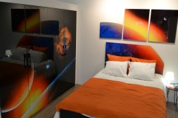
Trade shows are like school playgrounds in winter: the one with the red coat is the one that gets noticed. When organizing a participation at a trade show and putting a booth together you want to be that girl in the red coat. You can be the tall boy, who will be seen by everyone, just because he’s tall. You can be the loud girl, everyone can hear. You WANT, however, to be the girl in the red Featured imagecoat who gets noticed.

Everything starts with a stand building company that understands your briefings. If you ask our stand builder (please do: Expo Z, Belgium) they will probably tell you we’re not their easiest customer and that they do have their work cut out with us. If you’ve seen the booth, you’ll understand why. We do not have a “13-in-a-dozen” concept and needed a version 2 of the stand design, but the result was undoubtedly successful.

What we tried at FESPA this year was not to show the products, but the possibilities. I must admit: we have flexible products to work with. MDF panels become wardrobe doors, Featured imagea headboard for a bed or a picnic table. Aluminium panels of 5cm wide become art. The table tops were a launched product, the floor panels a prototype, but all these applications together created a complete world of sublimation possibilities.

What helps me is to pick a theme: we had 5 at this booth of 104 square meters – I love to make my life complicated. Picking a theme is possible for almost all products and prevents you from being the 5th indistinguishable company selling printers in the same aisle. Think about the little girl in the red coat.

When the stand is there, it’s the details that will make it work: thank you Unisub for providing the tools to finish it: coasters and serving trays in our Fruitorama bar, picture frames in the space theme, to go in the Featured imagespacey teen bedroom.

Last but not least: a strong team makes a strong booth. Our designer Liese did a great job inventing a Juicebar from scratch, our sublimation specialist Eva had nightmares of 5 cm bars in 6 different finishes, our warehouse team packed our samples so they arrived in the best possible way in Cologne, my sales colleagues helped putting all the samples up, our American CEO told FESPA-visitors about Large Format Sublimation during an educational seminar… A great team makes a great show. Thanks everyone!

Featured image


Featured imageCarolyn Krekels is jr Marketing Manager at Universal Woods EMEA, in Schelle, Belgium. She has been taking care of the EMEA marketing for the Universal Woods products for 9 years so far, first working for the EMEA distribution partner of Universal Woods. In 2012 she joined the Universal Woods EMEA team. In Carolyn’s posts, she will give you insight in the marketing actions organised by Universal Woods EMEA and can give you useful hands-on tips on how to bring your product to the market. Contact her via carolynk@chromaluxe.com